Connect the Dots Debuts a New Website
Connect the Dots has a new website! The undertaking of this project was an investment in our firm by creating a site that could tell the story of our work, mission, and better reflect the unique touch we have in the world of public outreach and engagement. It was a project about form and function. We worked with Butterland, an incredible creative web designer that understood not only what we needed the site to do, but communicated our personality, visually.
The Form and Function, let’s break down the function first.
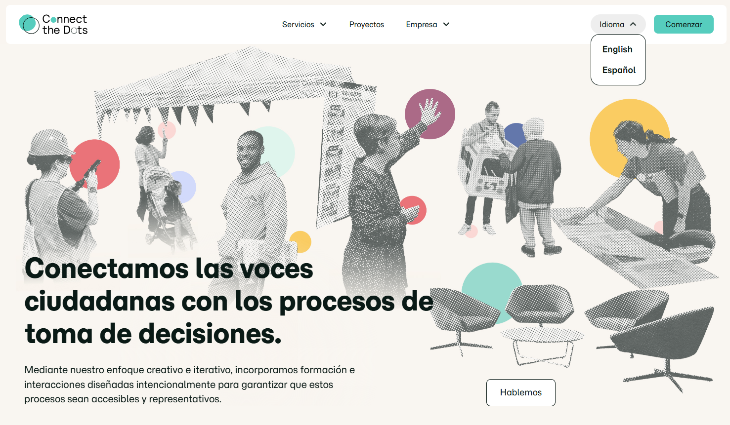
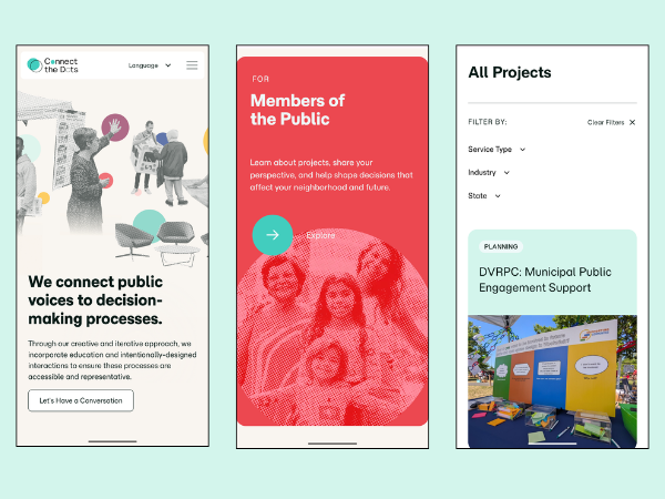
Our new website had to organize information for different types of website visitors, whether it’s a potential client, current partner, or local participant who met us during an event. Similarly, we needed to communicate our four services bundles in a streamlined and structured way. Now, you can easily navigate by starting at the Services Overview page to learn more about the audiences and services bundles or jump right into the audience that best reflects you.
Next, was a format to feature selected projects in a structured and navigable way. Our Projects page includes a filter bar with categories for Service Type, Industry, and Location, to find projects. Each project card then opens up to a landing page with highlights and the case study to read further.
Functionally, we also wanted to express that we communicate in other languages! This updated website is available to view in Spanish by toggling the language button on the top right corner.
A major component that makes CtD special is the team who brings the work to life. Our team members span a range of expertise and disciplines that are better reflected on the Our Team page.
Lastly, knowing that so many visitors may search our website on their smartphones, the site had to function smoothly when viewing on a mobile device. Now the quality remains the same whether you view on a laptop, tablet, or phone.
The Form
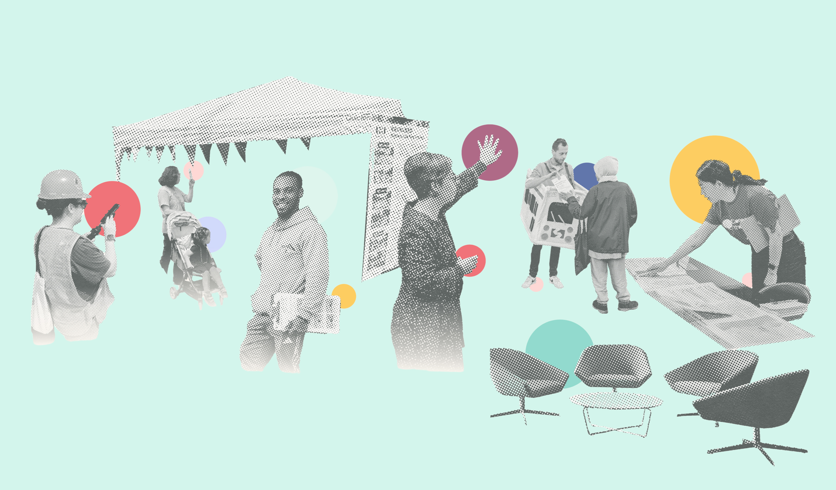
Butterland, who have built sites for other people-first organizations embedded our uniqueness within the functionality of the site to create something that really reflects Connect the Dots. The new look is built on three elements: halftone, paper texture, and pops of color. Here’s the inspiration behind the design in their words,
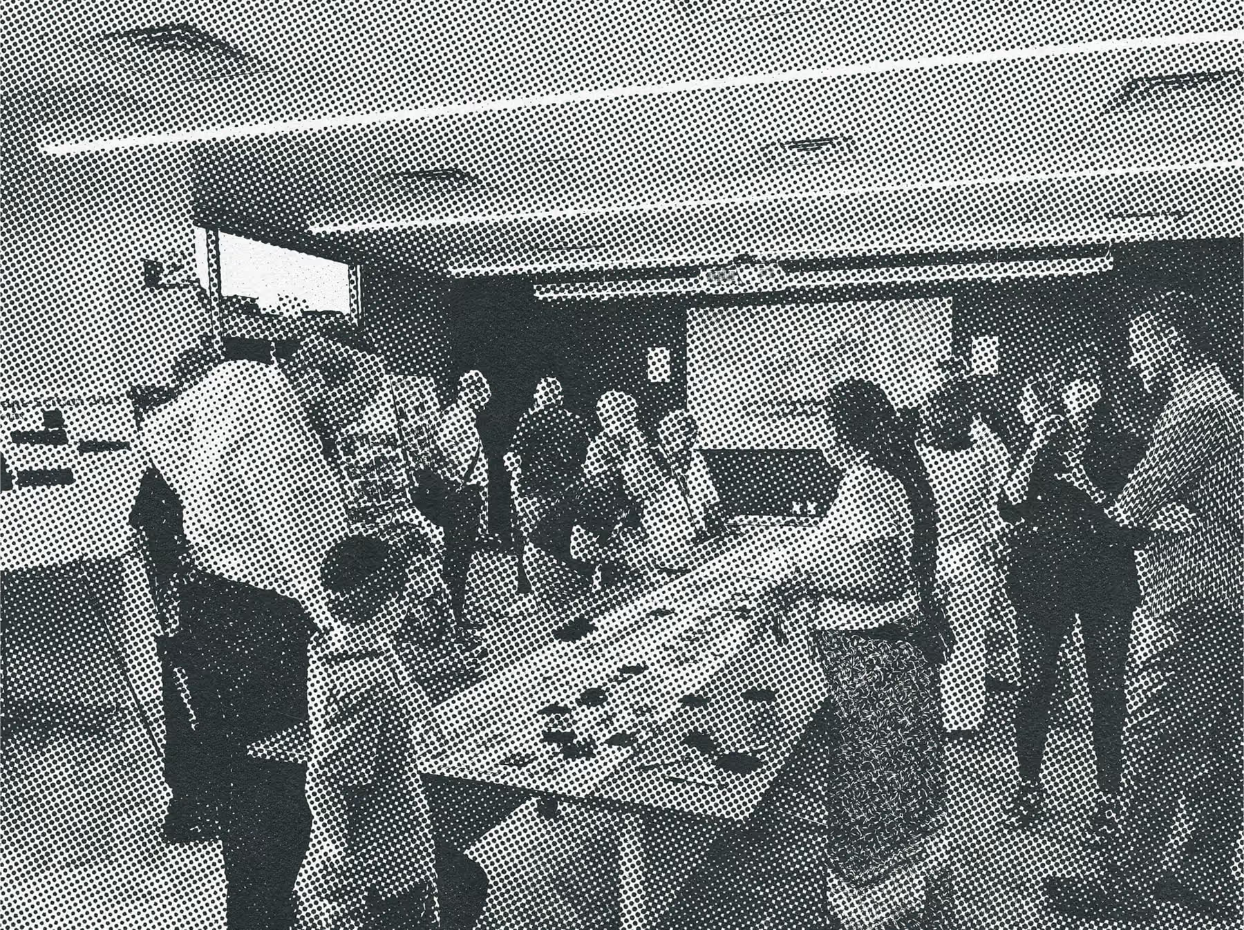
Halftone is a screen-printing technique that simulates continuous tone, like the smooth gradients of a photograph, using a mathematical dot pattern of a single color. The dots vary in size and spacing to stand in for grayscale. Big and tight reads dark, small and scattered reads light. Get close and you see the dots. Step back and your eye blends them into smooth tone. Halftone felt like a natural fit for Connect the Dots. The technique boils down to individual points coming together to form a whole picture, which is the company in a single image.
Paper grain and texture do the second job. They make the branded graphics feel tactile and handmade, so the work reads as something made by people rather than output by a system. For a company built on human relationships, that mattered.
Color does the third. The halftone field stays grayscale, so when brighter color breaks through, it carries weight. Those moments mark points of progress and connection, the places where the dots actually meet.
The [updated] palette is also a nod to the team. CtD's people come from a wide range of backgrounds, industries, and perspectives, and that range is a real part of why the work is good. Different sources, one picture.
We invite you to click around, explore the new website, and discover more about us.
About Butterland
Butterland is a creative studio making unexpected work that sells and sticks. Go-to-market, positioning, identity systems, websites, video production, and decks that close rounds and secure grants. Our Philadelphia work includes the Philadelphia Cultural Fund, Writers Room and Second Story Collective at Drexel University, and Crossing Streets, a public storytelling program bridging West Philadelphia and Chinatown. We build brands across arts and culture, impact, and tech. Nothing we make looks like the last thing we made. www.butterland.xyz
Connect with Us